
Original Picture and Introduction
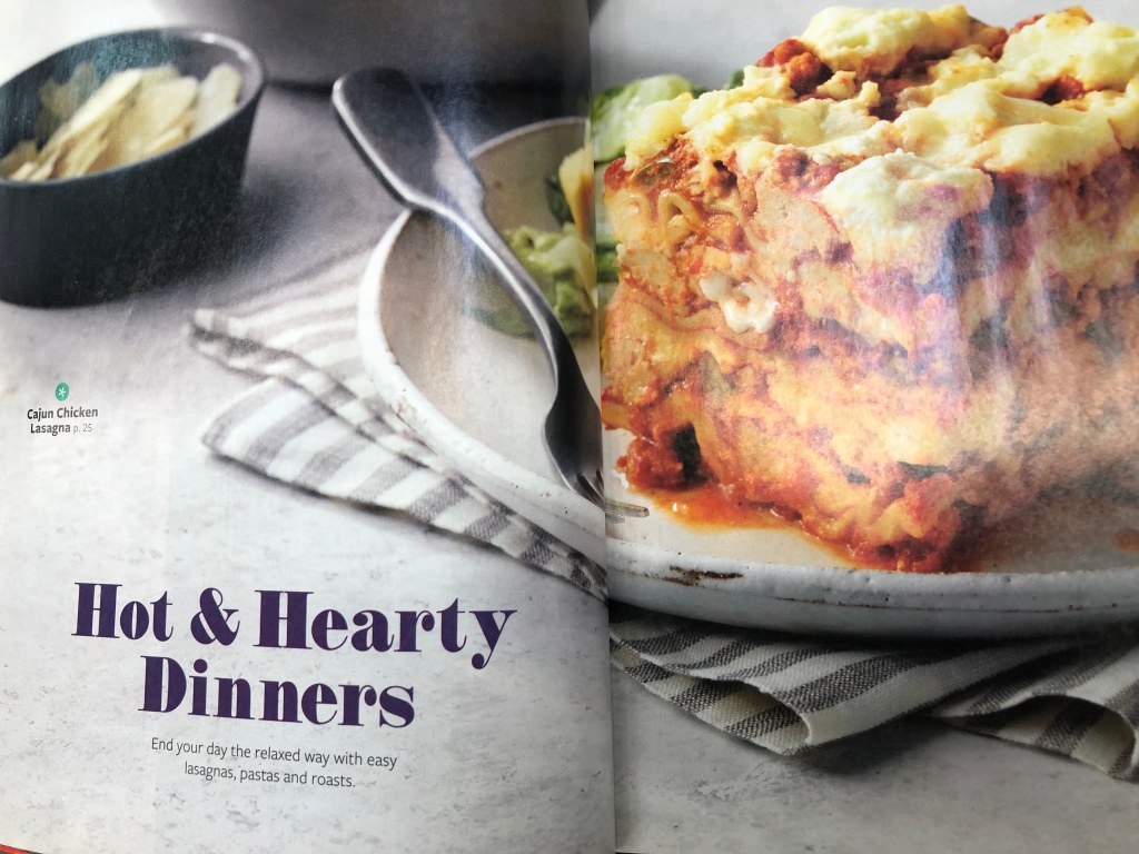
This original photo was from Taste of Home magazine. I couldn’t find any credits for the photographer, which is too bad because I would love to give him/her a pat on the back for this beautiful shoot. This two-page layout follows the guidelines for my school’s assignment because it shows beautiful examples of contrasting typography and basic photography principles such as rule of thirds and field of depth.
Category Identification
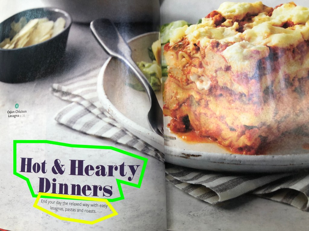
The first typeface (highlighted in green) I would identify as modern. It has a straight serif instead of a slanted one found in old style fonts. There is what’s called a radical transition from thick to thin in the strokes. The serifs are straight (or horizontal) and very thin. There is also no bracketing. The second typeface (highlighted in yellow) is sans serif. There are no embellishments anywhere in the typeface. The weight in uniform with no transitions from thick to thin. It is also in regular instead of bold to help further create contrast and distinguish it from the first typeface.
Typeface Contrast
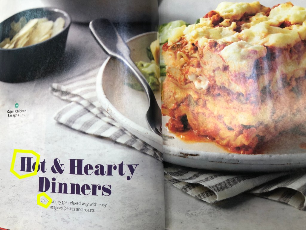
Speaking of contrast, the typeface contrast on this magazine spread really jumps out at you. You can see that on the first heading there is a Roman serif style font. I should note that the serifs are straight and not slanting. This also has a thick/thin element. Overall, it makes a bold statement that draws the eyes. The subheading is much smaller and in a completely different font style. The color is the same as the first heading to show unity, however there are some key elements that create the beautiful contrast. First, the text is sans serif which means that there is no change in the weight and there are no embellishments
Photography
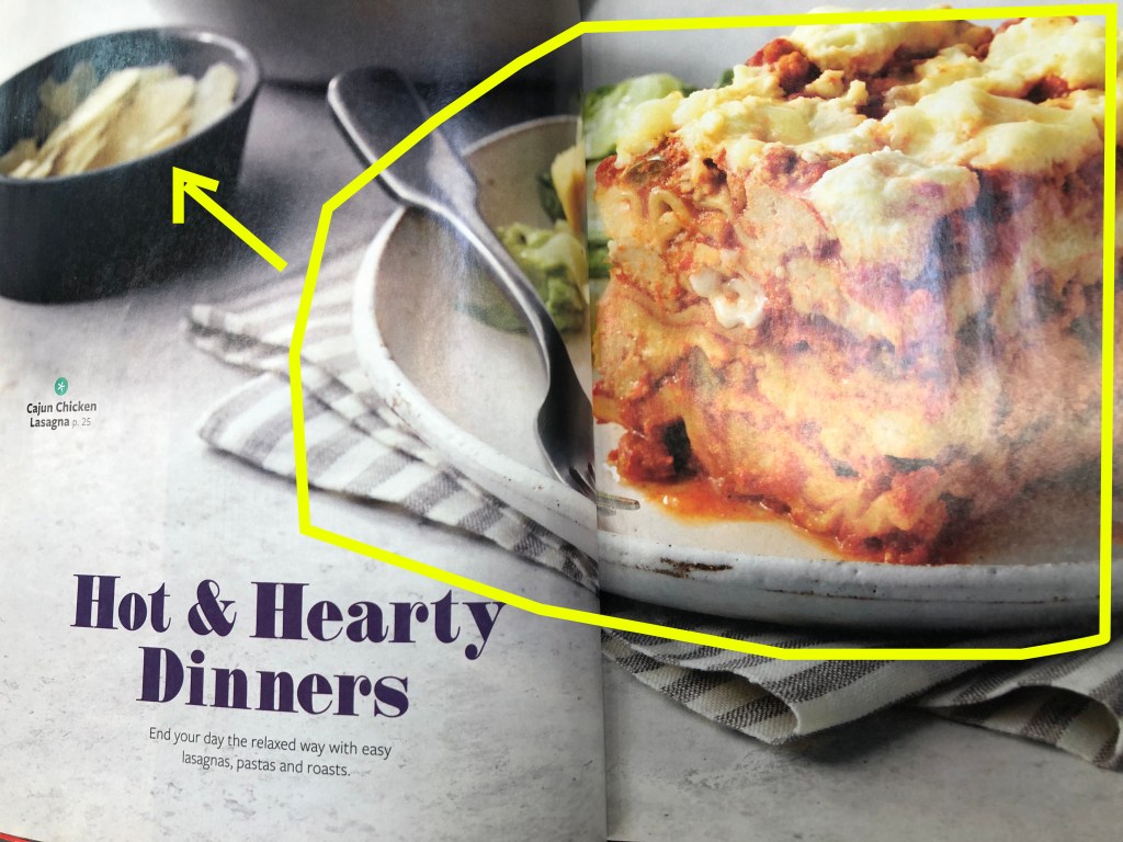
From what I can see, this photo uses at least two of the photography principles we studied this week. These two principles are rule of thirds and range of depth. You can see the rule of thirds because the focal point (the lasagna) is placed in the upper right corner. The range of depth is evident by the focus on the camera. The chip bowl in the background is not as clear as the plate of lasagna which is positioned near the front and in clear focus. This draws our eyes right to the delicious lasagna.
Alternate Images for Layout
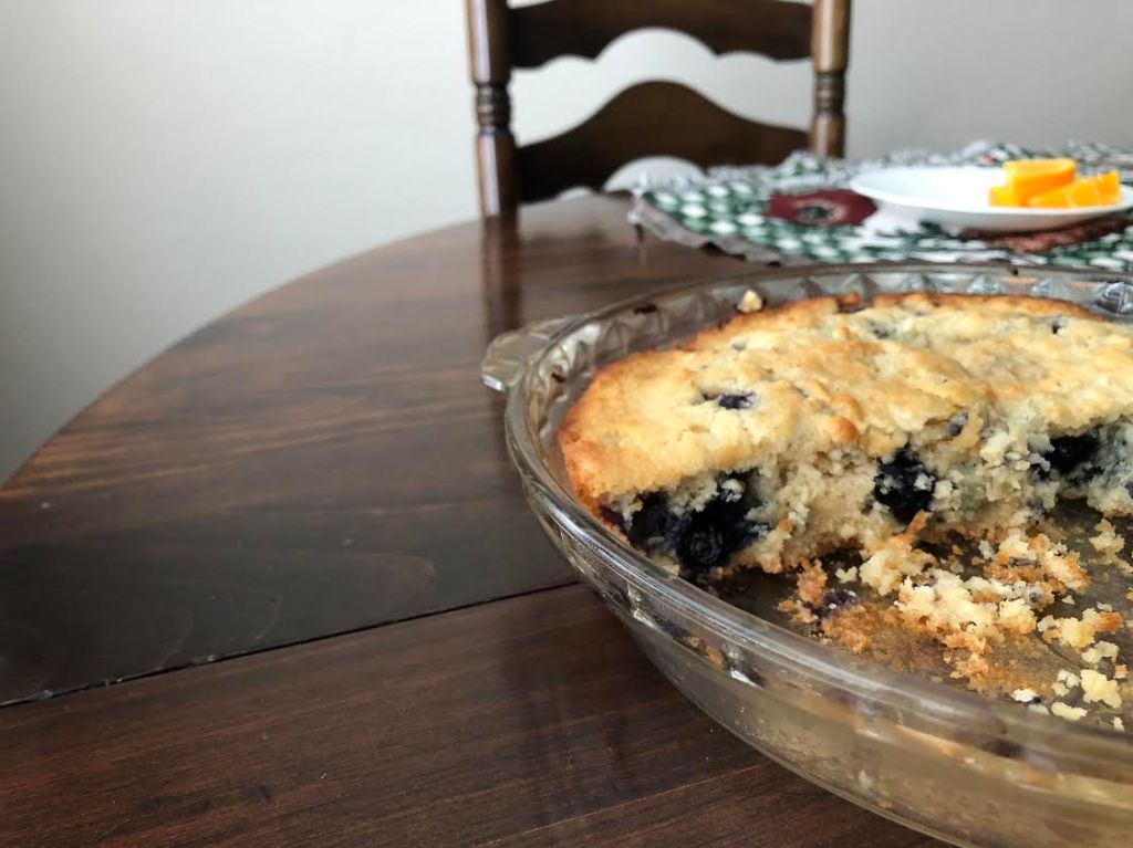
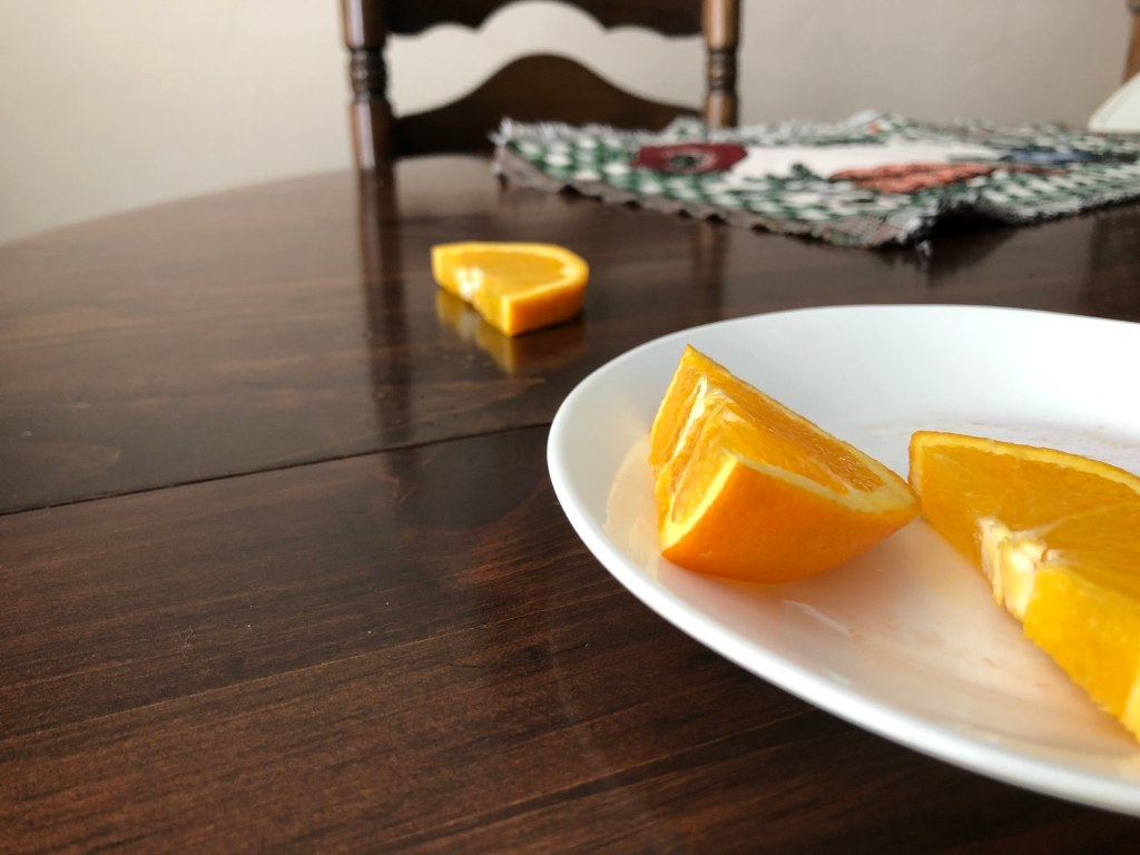
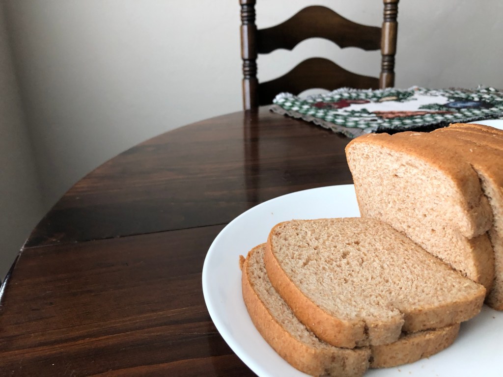
The following three photos were created using my cell phone. I was able to mimic the original photo by placing various foods on a table using the same rule of thirds and range of depth from the original photo. Yes, the foods are different, the table is different, but the key structure is the same.
Summary
I love how the rule of thirds and range of depth give a focal point to the original picture that creates a need for the typography to balance out the photo. This layout draws the eye toward the focal point of the photo, which is the lasagna. It puts the lasagna first in the range of depth because it’s closest to the camera. The typography itself is another example of balance because it uses contrasting font types and styles to create a harmonious look to the center-aligned text. This contrast was not created in color, but it was created in the differing typefaces, namely modern and sans serif. Each element of the photo and the typeface created a beautiful picture that tells a story about food, color, and the comforts of dinner. Who wouldn’t want to make that recipe and try the lasagna for themselves!
