Introduction
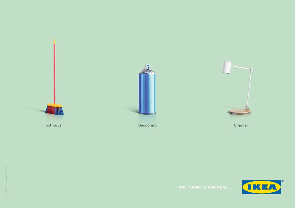
This is the original ad from IKEA. I don’t know who the designer is, but I think he/she or the team of designers and marketers were pure brilliance with this one. IKEA is a Scandinavian furniture store that offers much more than just furniture. It’s an experience for anyone who walks into one of their stores. I am always drawn to their practical storage ideas and their design lines that are influenced by minimalism.
The original ad can be found here: https://www.adsoftheworld.com/media/print/ikea_for_real_1
Original Ad Analysis
As mentioned already, IKEA is famous for it’s minimalism in the designs of their household items. This simple style carries over into this ad campaign extremely well. The typography is a very modern sans-serif type of font that is kept very simple in small text that is both black and white. Speaking of color, the background is a solid blue/gray that is very soft on the eyes and creates a calm experience for the potential customer. There is also a lot of space between each of the objects in the ad which contributes to this sense of calm. This further adds to the IKEA theme of clean lines and minimalism. The alignment of the three objects is symmetrical with proximity which draws the eyes to each object in turn. We see the idiocy of the claims that a broom is a toothbrush and spray paint as deodorant. But then we see the lamp and the label “charger” and it makes us think. Is this lamp really a charger? Because IKEA is always simplifying and streamlining, the answer is yes.
New Ad Analysis
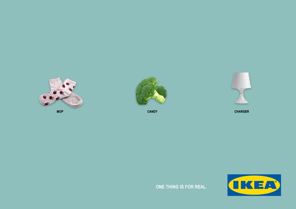
For my own ad campaign I used a similar calming color as the background for the ad. This will help to make the ad feel like it was from the same campaign without being exactly the same. Using the same concept for the objects, I created some unreal labels, claiming socks as mops and broccoli as candy. Then we have the little desk lamp labeled as a charger, much like the original ad but different. I kept with the theme of modern, simple lines that is IKEA’s ongoing theme with my choice of a sans-serif font and simple contrasting black and white colors. The design also has the elements of proximity, showing the relation of the three objects in the middle of the ad with the IKEA logo in the bottom corner.
Conclusion
Why the original ad and the new ad work together is because I am carrying the same message from the original ad into the new ad by using similar colors and other design elements. Those elements are consistent with IKEA’s theme of simple minimalism. The colors are basic and calming. The alignment of the objects and proximity helps to tell a story and make the reader double-take because of the idiotic claims of the first two images which are completely false. But, when the eye reaches the third object, we see this claim that a lamp can be a charger isn’t false at all. IKEA is known for making household items that are beautiful, practical, simple, and multitasking. The lamp is an example of these concepts in action. We all love IKEA for their furniture and other household items. Now we have another reason to love them because of their creative marketing strategies that coincide so seamlessly with their brand.